why design

my path to the world of design has taken me off of my original course, one that was paved and straight, to a rocky meandering journey through my left brain. The feeling I get when I see a well designed building or interior is an incredible rush of emotion and wonder. Through my design education I am now able to put words to these feelings and understand what it is about these spaces that amaze me. My ultimate goal is to be the one making these forms and to give people a holistic surrounding in which to live, learn, eat and be. I want to improve life through design. I seek out simplicity in my life and strive for it in my designs. Functionality, although it sounds dry, doesn't have to be boring and it is one of the things that I respect most about a well designed system or space. I am inspired most of all by the beauty of the natural world; I want to celebrate and protect it through my work.

5.30.2008

Materials Narrative


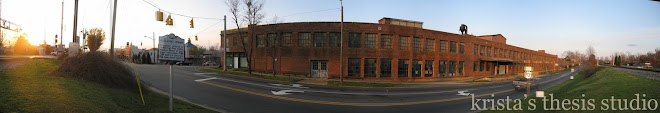
Drawing 1: Entry and Waiting Area

When you step through the front door to the restaurant there are three steps that take you up to the greeting desk. The original wood floors are at the immediate entry and on the stairs and beyond is a similar color dark wood. The risers are a pale sea foam green mosaic tile that has a frosty glass finish. The reception desk façade is the same green tile. The top of the reception desk is a smooth warm copper metal. Behind the desk is a tall glass partition made of different color tiles, on a much larger scale. After you check in the hostess gestures to the right where you see a waiting area that looks more like a lounge, next to large windows facing out to the street. Nearby you see the bar and you grab a drink before heading back to the waiting lounge which is quieter than the bar. The chairs are low and modern looking and there is a center table on which you rest your martini. You chat with your friends and enjoy watching the people at the bar, while still keeping an eye on the hostess station. Your chair is upholstered in a fuzzy off white fabric which contrasts with the smooth shiny wood finish of the rest of the chair. It also contrasts with the older looking flooring. The walls are what appears to be the original brick of the mill building.


Drawing 2: The bar seating area

You are headed back to the bar to get a second martini. As you stumble towards the bartender you quickly grab onto the nearest surface which happens to be a clear acrylic tabletop with specks of red. Light appears to be coming up through this material, but maybe that’s just the booze. Your eyes travel down this surface and you see it crosses another surface at the same height, this one is made of wood though, The red acrylic suddenly turns down and levels out at a cocktail table height. The wood countertop forms the back of a built in loveseat that ends next to the lowered acrylic surface. The bar stools are backless with a wood seat. They remind you of the lounge seating where you were just waiting. The wood bar surface heads all the way to the wall and then goes up and over your head where it holds recessed lights.


Drawing 3: The bar

Ok, you’ve made it to the bartender finally. That wooden bartop that ran overhead has continued to the actual bar and has come back down to bar height again. You take a seat and notice the red speckled acrylic forms the front of the bar and seems to glow. Copper forms the edge of the wooden counter top and connects it to the acrylic. After the bartender takes your order he turns around and grabs some bottles off of a shelf in the back that is connected to the wall through several wire attachments at the corners. Copper connects the different shelves together. You look around and notice this same wire mechanism is used in several places to connect the bartop to the wall behind it, and at the corners connects it to the ground.

Drawing 4: The Stage

You take a seat at the bar and look to your left where you see a small stage set up at a corner with a brick covered wall with windows on one side and a dark textured wall on the other. This textured wall is actually covered with grey wall panels covered in a traditional looking scroll design. Coming off from this wall are wooden bar height surfaces where people are resting their drinks. Above these surfaces is another wooden horizontal piece with lighting fixtures piercing through offering up and down lighting. These horizontal wooden pieces are held to the wall using the wiring technique you saw at the bar. The flooring surrounding the bar is a lighter colored cork, but the stage floor is the same dark wood that you've see throughout. The stage is 2 feet higher than the surrounding area. And inbetween the cork and the dark wood stage there is a narrow flooring change with brick.


Drawing 5: Dining

Your table is ready and you leave the bar and head down a few step into a quieter area. This area is surrounded by a three foot wall that isolates it from the rest of the space. This half wall becomes banquette seating on two sides and is covered in the small sea foam green tile on the other two sides. The banquettes are an off white fuzzy fabric but the facing chairs are a bright red. The tables are dark wood and match the floor, they are outlined in copper. Above the 3 foot wall is a foot high barrier made of the red acrylic material that goes around the perimiter of the space. Above this is a copper hand rail.


5.28.2008

Peer Review of Materials Charette


This afternoon we reviewed our teammates process work from the materials charette. I had the pleasure of reviewing Michelle Stohl's work in progress. Michelle is using an existing office building in Charlotte, NC to design a training center for Girls on the Run, a non-profit organization that helps girls succeed and break through social barriers. Her concept for this project is fittingly "breaking out of the box". She explores this idea through degrees of transparency and intersecting planes. Walls of varying thicknesses and textures pierce through each other and define space. A 3-form woven wall is the focal piece behind one coaching area for the girls. Michelle has created a mix of intimate spaces and group spaces to accomodate the different needs of the young women. In the lobby she has created an open inviting space using daylight and digital wall panels. My suggestions would be to develop further with colors that relate to the concept. The thick and thin penetrating walls work well, maybe place small individual or intimate nooks within the spaces they create when they intersect, and use these planes to develop shelving or storage. Maybe personalize different areas for the specific classes that they teach.

5.24.2008

5.23.2008

Esquisse: A Graphic


this graphic combines words associated with my design into a graphic which also relates to my design. I took the three most important ideas and made them the largest and looked for similarities in ways to combine them. The word "ambi" meaning both or two appeared as a way to combine them. Other words fit into these three categories and were spaced accordingly. The colors accentuate "ambi" and are the hues I want to use in my design

Esquisse: A Narrative

It is dusk as you cross the street and approach the entrance of the restaurant on the sidewalk. A train is crossing nearby as you see a two story brick building in front of you. Even before you cross the street you can see through the windows groups of people smiling and laughing. After the train passes you can hear faint sounds of music and can barely see a stage. When you open the door the music becomes louder as you enter a foyer with dim lighting. There are 2-3 stairs that take you up into the space. You smell fresh cooking garlic and rosemary. The brick you saw outside continues to the interior and you can tell from the high ceilings with exposed conduit and wood floors that this building has history. The foyer gets wider as you walk deeper in, but your view of the entire restaurant is partially obstructed behind a wall. You notice some level changes, but can’t tell yet where they lead. You can see the bar and stage to one side. Colors are deep and muted and keep emphasis on the brick and wood. Metals are matte and deeply colored. This heaviness is off set by the high ceilings. Your table isn’t ready so you head to the bar, following a path made through a change in flooring and vertical elements that separate the dining space. The bar is raised a few steps above the foyer level. At the bar, the noise level increases and you notice lighting accenting different elements of the space such as seating and bottle storage. The bar is not curved, but very sleek with metals and deep wood tones. Seating is plush and you make yourself comfortable at a loveseat where you watch the jazz band and can see the seating area off to your side. The stage where the band is performing is raised another couple steps and is near to some windows where people are walking by and looking in. There isn’t a space for dancing, but there are bar height tables nearby for people just interested in watching the band. As you move from the bar to the seating area you don’t go back the way you came, but step down into the dining space which is in the center of the restaurant. The dining area is the lowest level, at the heart of the space. You notice a change in flooring to a different shade of wood and also notice that the ceiling seems lower here. At your table you can see that the central dining area is surrounded by a low wall and railing which separates it from the rest of the restaurant. The low wall forms banquette seating around the edge. The seating is plush like the bar, but smaller. You can see the bar and stage still from the dining area but the surrounding sounds are dampened and you are able to speak at a normal level at your table to be heard. You can see there are several stairs leading down into the dining area, each coming from a different part of the restaurant, one from the bar, one from near the foyer, one from the back by where the kitchen is, and one on the 4th side which appears to lead to a private dining space on the main level that can seat about 20. It is partially blocked by the same vertical elements seen throughout the rest of the space. Throughout the space you notice shades of red used as accents mixed in with the metals, wood and brick. Vertical elements and level changes are used to separate the spaces visually. Lighting accentuates the level changes.

5.21.2008

1st day of summer thesis studio

Today was the start of a very intense 8 week long studio that will culminate in my graduation from the Interior Architecture Department at the University of North Carolina at Greensboro. This blog will be a way to document my work over the course of the studio and will allow me to share my work with my family, friends, peers and professors.